If you’re starting a new business or reshaping an old business, you know you need a company name and logo. Chances are you have already considered a name, drafted several taglines, explored a collection of logos you like, picked out a few company colors and written out a mission statement. My question for you is: have you considered the larger business branding and logo design opportunity ahead?
Focusing on the aesthetics of your business and a 30,000 foot view mission statement are important and definitely deserve attention. However, you are in a unique position to actually facilitate a much more powerful connection with your client than transactional – you can create an experience that shapes their buying decisions as well as their desire to promote your company to others in their network.
In this article we will unpack the many aspects of branding your business and provide you with new information to consider as you shape your brand now and into the future.
Literally Branding Your Products and Services
The term ‘brand’ or ‘branding’ has a rich history. The most vivid picture for how we perceive the concept of ‘brand’ is the physical brand ranchers and cowboys use on their livestock.
For example, meet Steve Edwards of Queen Valley Mule Ranch in Arizona. Steve’s logo is literally a brand used on his animals. When he brands his animals, he uses a custom iron with his custom design. He places the iron into a fire and when the iron reaches the right temperature, he removes it from the fire, takes the iron and brands his animals.
Steve is a world renown cowboy and mule trainer who has built his entire livelihood on the back of his brand. Customers can identify which mules and donkeys have been trained by him because of the branding, then call by the hundreds asking if he has any animals for sale. That is what we call a powerful brand.
The influence of his business brand and logo design extends to his saddles and other tack bearing his name, and successfully marketing and selling his products online.
Steve’s logo tells customers which products are his. Why does that matter? His customers want the confidence that comes with his logo such as trust, quality, well-trained animals, properly designed saddles, and high quality tack. The logo isn’t the brand. The logo is the artistic representation of the brand.
A company logo is not the company brand. The logo is the artistic representation of the brand.
Business branding and logo design is most definitely visual. Drive around in the car with a five-year-old who has no ability to read and he will be able to ramble off the names of major brands he sees on signs along the road. This level of brand recognition is achieved through the use of consistent visual elements, but what we don’t see is the level of work these mega brands put into shaping an entire experience that ultimately gives the logo its influence.
Representing Your Brand When No One Can See Your Logo
At Shrein Media, we regularly work with companies to create company logos that communicate brand values. The company mission provides the “what are we trying to do” and the brand values represent the “how we are going about doing it.” These values are ultimately what provide the power to a logo. Our process doesn’t begin with design, it begins with values.
One of the questions we ask during our process is, “How do you want someone to feel after interacting with your business for the first time?” A second question we ask is, “What do you want your clients to think about when they see your logo?”
Nowhere in our initial discovery questionnaire do we ask, “What do you want your logo to look like?” Why? Because our goal isn’t to create something that just looks good. What we want is a design that represents a promised experience and connects the experience with emotion to form a deeper bond with the customer. We want something that represents company values – let’s call them brand values.
A strong business brand and logo design connects a visual experience with an emotional experience to form a deeper bond with the customer.
The questions posed above, “How do you want someone to feel…,” and, “What do you want your clients to think…,” represent a touch point in your company. A touch point is when an individual interacts with your company on any level and is your opportunity to live out your values. Some other common touch points may include:
- Scheduling an initial sales call
- Customer service and support calls
- The checkout/purchase experience
- A return or refund experience
- Your company or individual outgoing voicemail
- Email correspondence and communication
- Incoming calls to your company, reception desk
- Experiencing your product for the first time (opening your product)
Think about the touch points that exist in your company. Maybe there are several in the list above that are relevant to you. Let’s say that customer service is on your list. Every customer service interaction communicates your brand values, what you want your customer to feel and experience during support interactions. When a member of your team is on the phone with a client, that client won’t be able to see your logo, they will hear your brand through the words, tone, and attitude of the team member.
Before ever getting into the importance of visuals, it is imperative to understand and believe that business branding is so much more than just a logo design.
What Your Branding and Logo Says About You
Your logo will become a unique identifier that visually represents the basic idea of who you are and what you do. It works in tandem with your business name to communicate your brand. You’ve been strategic with your business name and you’ve thought through your products and services. When you add a well designed logo to the mix, you communicate the value of your brand.
An Example of A Great Brand Name, Product Name, and Logo Design
The Kimberly-Clark corporation is a great example of the name they chose to represent their diapers: Huggies®. Huggies® have become synonymous with diapers and for good reason. The name is quite witty as the product actually does what the product name says on multiple levels. From a abstract level, they hug your baby. From a practical level, the product is actually hugging the waist and legs of your baby, providing a valuable function. From a 30,000 foot level, the diaper is hugging your baby and perpetuating the values of everything you project on your baby: love, tenderness, care, service, cleanliness.
The logo they have chosen to go with their brand name and product function is strong because it actually communicates something about the brand. The letters are rounded and appear to have a softness to them, both literally and figuratively. Behind the letters is a soft silhouette of a diaper in a red color – red is the color of love.
Huggies® could have just said ‘diapers,’ but that’s not what people want. People want compassion, care, cleanliness, and love for their baby, thus, they want a diaper that does the same thing. It’s a very effective brand.
Your Brand Name, Product Name, and Logo Design
You want your brand name, product name, and logo design to do the same for you as Huggies® does for Kimberly-Clark. You want the combination to communicate and be an advocate for you when you’re not around to sell. You want to evoke positive emotion when people interact with your brand and, even if they don’t know who you are or what you do, the combination of the three will communicate for you.
If you select a logo based on, “Oh, I like the way this looks,” that does nothing for you. It’s not about you, it’s about the people you’re trying to serve and communicate with.
What Are You Saying About Yourself?
Have you heard the saying, “The cobbler’s children have no shoes”? A cobbler is someone who repairs shoes, so for a cobbler’s children to have no shoes says a lot about the cobbler himself.
The cobbler is great at what he does, his reputation precedes him, and yet, he is unable to provide the same level of care for his family that he demands in his work for his customers.
How does this relate to logos?
It is very tempting to bypass any type of process to develop your business branding and logo design and just put something together so you can get on about your business. You play the role of expert for your client and sell them on the value of your expertise; it’s easy to not approach something like your own branding or logo design with the same attitude. You wouldn’t be alone, a lot of companies will try to just ‘get something put together’ in-house without the help of experts in design or branding.
It’s hard to trust a cobbler with your shoes when his own shoes are in need of attention or if he can’t keep shoes on his children. He may be fantastic at his work, but his lack of care for his own needs communicates something to potential clients. The same goes for your branding and design. Your logo will communicate to potential clients. Make sure they are getting the precise message you want to send.
Branding Your Business With A Company Logo
Hopefully, you now understand that your brand is more than a logo. As easy as it would be to accelerate right to designing a logo, taking time to consider what you’re trying to communicate will not only give you a more compelling logo to call your own, but you will also have a greater story tied to that logo, making it a more powerful symbol for your employees, your customers, and future clients.
The logo you choose to represent your business will be a marker of your identity. Like Steve Edwards uses his brand to identify which mules and donkeys belong to him and which saddles are manufactured to his standards, your company will have an identifying marker. There are several elements that are found in typical logo designs.
The Logomark
The logomark is what most people think about when they think logo. They are thinking about some illustration or design that represents a company and doesn’t rely on or incorporate words. This logomark can be combined with words or letters to form the complete logo design, but the element itself is a logomark.
The Logotype
The logotype design is what most would describe as a font. Contrary to what many people believe, logotype compositions are very difficult to create as they rely almost entirely on manipulating letters to form a recognizable and distinguishable design. The manipulation can be made to a font style that already exists or the creation of an entirely new font that is used specifically for the design.
The Combination Mark
An official logo can just be a logomark or a logotype design, but most logos will be a combination of the two and that is what’s known as a combination mark. The combination mark may be presented in a variety of arrangements, colors, and can even include additional content, such as a tagline or special insignia.
One of the questions we will ask a client who has chosen us to create their visual branding is, “Where have you used your logo in the past or where will you use it in the future? (Web, printing, t-shirts, business cards, banners, etc.)” Not that the answer to this question will drive the design, but it helps our illustrators get a feel for any unique placements the logo may appear so that we can ensure the design has ultimate flexibility.
How to Select A Great Logo Designer
When you start the search to find the designer or company you want to work with for your new logo and visual identity, you will have a lot of choices. It should be said that if you have a company that you’ve worked with in the past and are happy with the way they work, their quality of work, and their pricing structures, give them an opportunity to work on your current project. They will know you better than any new agency or illustrator you could choose to work with and will be in a very unique position to advocate for something that really represents your business.
That said, here are a few factors that you should take into consideration.
Cost Should Be A Consideration
Cost definitely needs to be a factor, but it shouldn’t be the only factor. Immediately after finishing your logo design there will be a laundry list of places you’ll need to apply the design to.
For instance, one of our clients was opening a retail location and they were about to spend several thousand dollars on a marquee sign at their storefront. Their current logo was something that had been thrown together without much thought given to it. As we were finishing up their website we took on our role of advocate and said, “We know you’re getting ready to spend a sizeable sum of money on a sign. Would you be open to discussing a professional logo design so you spend your money on something you love and are excited about having over your front door?” They said yes and it looks amazing.
You will spend more money using your logo in social, web, email, video, and print then you ever spend creating your logo. You want your financial investment in a design to be in line with your financial investment in printing that same design.
The amount of money you will spend printing and displaying your logo will dwarf just about any sum you spend creating your logo. You want to go through a process that delivers a design that has significance, can tell a story, and looks stunning in every location it’s printed. Often, going with a cheap designer or trying to design something yourself will produce something you’re fine with and rarely anything you’re in love with.
Experience and Breadth of Work Should Be A Consideration
You are not a branding expert – so you want to make sure you work with someone who is. You want an experienced designer who knows what you need without you having to ask. For instance, you may have a vision for a brilliant design with a beautiful color palette. Your design looks stunning in full color – but what about in black or white?
“We are participating in a major fundraising event. The corporate sponsor asked for a monochrome version of our logo. I wasn’t thinking about that when I designed it in 2014. Thankfully, I could make it work, but initially I thought, ‘Yikes!'”
– Patty Gray, Director for Crush Rett Syndrome – Gilbert, Arizona.
How will your design appear when it’s embroidered? Will it look good in newsprint? Can your design translate from a full color design using five colors to a one or two tone silkscreen for t-shirts?
An experienced designer will consider all logo applications including print, embroidery, social media, website placement, and even creating special graphics like YouTube thumbnails for your videos. The designer will help you make decisions along the design process so you don’t get to the printer and realize that your design has to be printed in full color in order to be legible.
You will be able to look at a designer or agency portfolio and immediately tell if the designs are token and amateur or if they have a pro feel. It doesn’t matter if you want a simple or complex design, a clean or distressed design – an experienced designer will show you a portfolio full of polished concepts that communicate much more than a company name.
Communication and Ability to Follow Instructions Should Be A Consideration
Trusting that what you communicate is what will be delivered is an underrated but much needed consideration when choosing a designer or agency. Will you be able to meet face-to-face or over a Zoom call? Will they understand your non-designer lingo and be able to translate what you say in order to incorporate it into your design in a way that makes sense?
You don’t have to interview the illustrator or designer but if you’re committed to a great logo and you want it to be part of a strong business brand foundation, it is probably a good idea to make sure that you like their approach. At Shrein Media we would say, “if you dig our vibe.”
Communication is very important and if you have zero real time communication with the illustrator or project manager and everything is through email, there is a lot of room for miscommunication that will translate into a design that isn’t quite what you wanted or a design that won’t work long term.
If you have a designer or agency that you’ve worked with in the past and you’re happy with that relationship and the quality of work, there is no reason to look elsewhere.
Steps to Design The Perfect Business Logo
When we begin discussions with a client about designing a new company logo, most of the business owners we work with already have something in mind. The same is most likely true for you. You have seen another business logo you like or maybe you’ve had some rough sketches drawn up that incorporate elements from other logos. As you’re testing ideas you show concepts to friends and family members and they make recommendations too.
Pinterest has become a really popular way for business owners to get a vision for their business logo. If you’re wanting to launch a law firm, Pinterest makes it easy to search ‘law firm logos’ and see hundreds of designs that represent different legal entities.
Don’t Limit Yourself to Industry Typical Designs
One of the best ways to ensure you end up with a fantastic design is to be willing to go outside of your industry for ideas and inspiration. Your design isn’t supposed to represent your industry, it is supposed to represent you and connect with the customer you want to work with.
Search for other industries to see what their logos look like. Here are a few ideas:
- Medical practices
- General contractors
- Musicians
- Software companies
- Startups
- Restaurants
- Vintage logos
- Clothing companies
Obviously, those are just examples. The important thing is to look at a wide variety of industries to get a broad range of inspiration. If you’re working with a team, it might be difficult to get them to understand they’re not picking a design to follow, they’re picking inspiration.
Go With Excellence – Opinion Is Overrated
As mentioned earlier in this article, we try and steer clear of the question “do you like this?” Honestly, we don’t really care about what one person may or may not like. In addition, when you go through a process of designing a brand and logo, the process makes the end result more valuable – to ask someone who was not a part of the process, “Do you like this?” is not fair to them nor is it fair to the design.
Opinion is quite overrated. Yes, you need to like the final design and that is why there is a process, to ensure the design is put together in a way that is pleasing to stakeholders. However, stay away from the toxic, “I’ll know it when I see it,” approach. At that point it becomes less about good design that communicates your company values and more about how one design may appear over another at a specific point in time rather than the merits of the design itself.
Going with ‘what you like’ isn’t giving you a brand – it’s a visual preference. You want a brand.
The Importance of Great Visual Design In Your Logo
A great visual design for your business is only possible when you’ve established what you want people to think and feel about your company. Why? Because potential clients will begin forming thoughts and emotions immediately after casting eyes upon your design for the first time. You want to communicate your company values through your design.
So what are your company values and how do those values impact your design?
At Shrein Media, one of our core values is being the online business advocate for our clients. Our role as advocate means that we are in constant search of better, more effective ways of marketing online and recommending those findings to our clients. In addition, we speak up to offer advice to a client when they may want to make a decision about their marketing that may not be in their best interest.
As an example, when we are in talks with a company to design their new logo, we tell them, “We won’t design what you say you want, we will design what you say you need.” That is a very big deal because most clients we work with want something that just looks good, nevermind if it represents the experience they are going to provide their clients.
This should actually sound familiar. In your business, you will come across many clients who think they know what they want but, in reality, they need something completely different.
At the end of the day, the client should love the design we propose, but we don’t start with a collection of designs and say, “Which one do you like the best?” We start with a series of poignant questions that are meant to help us unearth their perceived need for a design or redesign of a logo. From there, we aim to satisfy that need through the designs we present.
How is this value present in our design? If you look at the ‘S’ icon, you’ll see that it actually forms a conveyor belt that moves ideas along from one step of the process to the next. It’s not a rush to the finish, but a standardized process that produces a strong, final product.
“There are certain elements that make for a well designed logo. You want it to be simple – not complex but jumps out at you. You want multiple versions including color, black and white, and icon with all representing the same mark. And you want it to represent your culture, what you sell, what you promote. In this way it’s purposeful and not just a random design.”
– Katie Simon, Owner of Blue Fox Branding – Gilbert, Arizona
An onlooker may not be able to detect our value of advocating simply by looking at our design, but as they experience our brand, it will start to make sense and they’ll associate advocate when they see our design, especially if we ever explicitly tell them about the connection.
Designing A Logo You Will Love Always and Forever
As referenced throughout this article, our team utilizes a very simple yet effective process to hone in on what you want your logo to communicate to the world. Once that process is complete, it’s time to get to designing.
Your Design in Black and White
It’s easy to start combining example logos with colors we like. Color really provides strength and personality to the design – which is why it should be added last. If a design can stand on its own in black and white, color will enhance the quality of the design, not compensate for a lack of quality. So, your logo, your logomark, and logotype, should start off in black and white to ensure that color doesn’t create the logo, it compliments it.
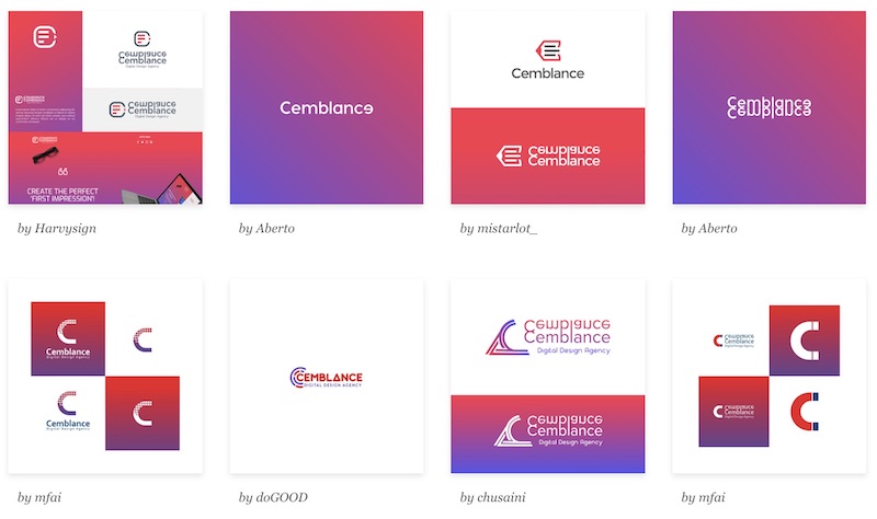
Choose A Concept to Pursue from A Collection of Three to Five Designs
There are crowdfunding services which will allow you to pay a small sum of money to have 30, 40, even 50 different designs to choose from. As appealing as that may sound, what you’re really paying for is quantity over quality. This “no limits” approach fails to lead you through the most important part of the design process: creating boundaries.
Remember, we’re trying to communicate, and in order to communicate anything you have to make a conscious decision to not communicate everything. When you start with three to five designs, you are creating boundaries to work within. Your process of elimination will have to be more strategic because you can’t just wipe the floor with all the designs and start over. If you trust your designer and you trust the process you’ve gone through, the concepts in front of you are exactly what you need and exactly what you asked for. You may not like them as is, but start pulling out the elements that you do like.
At this stage you can combine elements from each design to form evolved versions that connect better with you and your messaging. A good design phase will have at least one more major round of revisions and at least one minor round of revisions.
Again, don’t look at the limits as holding you back. See them as boundaries showing you exactly where you can go to succeed. In sports, there are boundaries to let players know where they can go and what real estate they can use and still accomplish their goal of scoring. Foul poles and sidelines are a good thing, embrace them and your end result will be better for it.
Inject Color
Once you have a solid design that you feel 80% good about, it’s time to start injecting color. So what colors should you choose? Colors have meaning and coordinating the color theory with the design message will help you get the most out of both. There are elements that might not be able to come through as strong without color and there might be elements that color can’t communicate at all. That’s why the two work in tandem.
If you want to bring out growth – your company is strong and growing – consider greens, yellows, and oranges. These colors are synonymous with the growing season. Be aware, though, about what these colors could also communicate. For instance, we worked with one healthcare company who wanted to stay away from green because it’s the color of money; they wanted to disconnect money from health care so as to not miscommunicate.
Let’s say you want to show that you’re company is serious and strong, reds, oranges, and some maroons will extract those traits. Sometimes red can be associated with ‘stopping’ so you’ll want to be sensitive to the shade of red you use, as well as how it is applied to ensure that you’re tapping into the trait you want.
To show that you’re decisive, strategic, cool, and calm take a look at blues, purples, and fuchsias. For Shrein Media, we chose blue particularly because of these traits. We are very strategic in our approach to everything. It’s never a matter of simply choosing “A or B” – we ask questions to help guide us to an educated selection and throughout the process, project calm and measured emotions.
Choosing A Color Palette that Will Work for Everything
Once you’ve landed on your final design and chosen a colorized version you feel good about, it is time to round out your color palette. Your palette should consist of the following:
- Single Primary (Main) Color
- Single Secondary Color
- One to Three Accent Colors
- One Black Tone
- One White Tone
That’s the bare minimum we include with every color palette we create for our clients. Obviously, you can expand those colors out further or retract them in to use only a few. The goal here is to find colors that work well together for multiple applications. It’s also to prevent you from feeling the need to select colors on your own. Selecting a strong color palette is a skill – working with a professional designer will help you get a palette that works for you and works for everything.
A final word about your color palette, it’s not uncommon for a company to have an expanded set of colors to use for print, a separate expanded set to use for videos, and a specific set of colors for the logo. This is all for consistency and to ensure the right colors are used in the right places. So if you feel like six colors is a bit limiting for video work, come up with an expanded palette that you reserve for video.
“A strong color palette can really be a great contributing factor to the personality and meaning of a brand. Our platform provides churches of all different denominations and sizes with various digital resources. We felt incorporating a stained glass concept would really be representative of the people we serve and the way in which we serve them. It only helped that a stained glass color palette is the sort of imagery our target audience is already accustomed to.”
– Justin Trapp, Founder of Ministry Pass – Magnolia, Texas
Beware of “I’ll Know It When I See It” Design
As we already discussed, the “no limits” approach to your logo doesn’t create the one thing you need most in your design: boundaries.
At Shrein Media we give our clients the choice of selecting how many rounds of revisions they would like. Most designs can be completed in three rounds of revisions because prior to agreeing to work with a client, we address the “I’ll know it when I see it” approach to logo design.
This mentality is often present when there is a higher priority placed on what the logo will look like versus what it communicates and represents. And that’s okay. It may not be the wisest approach to branding your business, but when a business owner wants something that simply looks good to them, we will often direct them to the “no limits” services.
Another reason this mentality might creep in during a process is because the process is hard. Making decisions that will impact your business identity for the next five to ten years is daunting and you want to make sure you get it right. We build up the decision so much through the process that it’s easy to want an ‘ah-ha’ moment of clarity so you can say, “That’s it!” If that feeling doesn’t come it feels like you’re settling, when in reality you’ve actually created something that accomplishes exactly what you need – though it may not be what you thought you wanted.
The understated value here is to know what you want in a design and design process, then match up with the right partner, as we discussed above.
There’s a good chance if you’ve made it this far you are interested in creating an amazing brand and less interested in choosing from a bunch of graphic designs. There’s nothing wrong with wanting to see a lot of designs, but we advocate for selecting from a few strategic designs with depth, rather than a myriad of whimsical designs.
Immediate Placements and Uses for Your New Logo
As you arrive at a final logo design, you will want to begin to consider the immediate placements for your new design. As we covered above, there are several approaches to your final design: logomark, logotype, and combination mark. How will your logomark look when it needs to appear in a banner? How will your logotype look when it needs to appear in a square? How will your combination mark look stacked when it needs to be printed in a wide newspaper ad or in the header of your letterhead?
These placements should influence your primary logo and also inform whether you need a secondary or alternate logo layout.
For instance, if your company is on social media you will want to use your logo for your company profile image. Typically, the profile image is going to be a 1:1 ratio, otherwise known as a square. If you choose a combination mark that places the logomark to the left or right of the logotype, there is a good chance that your design will look ‘squished’ in the profile image. In this case you would want to either use the logomark only or use a stacked version of your combination mark.
A Portrait Logo Design
A portrait combination mark logo design, otherwise known as a stacked design, places your logomark on top and your logotype underneath. You can swap their positions if desired. This stacked logo gives you a great portrait layout for taller, thinner applications.
A Landscape Logo Design
The landscape combination mark logo design places the logomark to the left or the right of the logotype – typically to the left. This application is great for banners and wide placements. It is also a strong application for 16:9 (widescreen, HD) ratios that are common across all entertainment type screens.
In addition, many website headers will favor a landscape layout because it prevents the header from taking up an unnecessary amount of space. Our team most always uses the landscape version of the logo for website headers, thus we ensure that no matter what design the client chooses, they have a landscape version available.
The Logomark Design
As mentioned earlier, this is the design where the logomark is on its own, no words or logotype. This version of the logomark can be an exact duplicate of the primary design logomark or an adapted version that is to be used only when unaccompanied.
Using the solo logomark on its own is great when the application contains the company name elsewhere in the design, for example in in an email signature where the company name is listed along with the employee name and job title. In this situation it would be redundant to use the full combination mark so the logomark on its own is perfect.
The Alternate Design and Layout
Out of the portrait and landscape designs you will choose a primary layout. This is the layout used when the spacing and ratios are a non issue. The other logo will be your secondary layout.
A primary and secondary layout are typically all you will need, however, there is sometimes room for or a desire to have a third, alternate layout.
The alternate layout is often birthed out of a specific need or desire – either in how the logo communicates or how the logo looks. This alternate version may be created to cater specifically to a type of printing. Perhaps your primary and secondary designs have a large logomark and smaller logotype. However, when you go to embroider your design, the words need to be larger in order to be more legible. The third, alternate design would be the same as the primary logo, but with an enlarged logotype.
The Font Only Logo
As much as the logomark is what people think of when they visualize their logo, your design doesn’t have to include a logomark. Brands like Coca-Cola, Google, and Dell have done very well for themselves with a logotype only font. As mentioned above, creating this type of design is very difficult, not only in terms of design but in also satisfying the client.
Our designs almost always include a logomark because when only presenting a logotype we will typically hear comments along the lines of, “It’s just a font.” When clients are wanting to be wowed, presenting with a logotype design may be exactly what their company needs but unless they specifically ask for it, it’s a tough sell.
Combining artistic design with a readable font (custom designed or adapted), and incorporating the company’s brand into it is a trifecta that is even more difficult than a hockey hat trick. The designs are usually very simple and very classic.
When we design a combination mark we invest a lot of time in getting the font selection correct. Even though the logomark gets most of the attention and the praise, the logotype is what needs to be readable and engaging. When we deliver a final logo package, we include a logotype only design because we know the company will need it – and be grateful for it when the time comes to use it.
Having A Versatile and Agile Design
Going through a thorough and professional branding and design creation process and working with a qualified illustrator and/or communication company is going to ensure your logo is versatile enough for nearly every application. The professionals handling the project will be anticipating all the different ways and places you’ll be using your logo and will be thinking on your behalf to ensure the perfect iteration is ready to go when you need it.
Beware of Warping Logos
After all the time and effort you put into designing your logo, it is very important to understand the concept of warping and be able to spot it when it’s happening.
A warping logo has the appearance of being squeezed, scrunched, or stretched out. This is often done inadvertently when trying to get a logo to fit on a document, in a presentation, or otherwise place it in a location where it doesn’t fit exactly. While designers and company owners typically know to keep the design consistent and not stretched, other team members don’t have the same eye for design and are just trying to get their task done – not knowing any different.
Having a variety of layouts often mitigates any inadvertent distortion of the logo; even still, it is important to educate anyone who might be using your design about the importance of maintaining consistent dimensions and ratios for the logo and that the logo shouldn’t be changed in any way or form; if a different size is needed, that’s what the additional layouts are for.
Warping your design in client facing documents is one way to immediately lose any power your design had to compel and engage the client. Having a variety of layouts really helps keep the design integrity across all applications.
Choosing A Standard Font for Company Correspondence and Design
Every time you open your word processor you have a choice of standard fonts to choose from – and quite a few not-so-standard font choices. When you want your document to have a little bit of flare and energy, it’s easy to begin scrolling through fonts to find one that feels right. The problem is that ‘feels right’ is subjective and what ‘feels right’ to you may not ‘feel right’ to another member of your team.
As you go through the process of designing your logo, you need to consider the benefits of choosing standard company fonts to use for presentations, letters, print, and other areas where you want your brand to be present.
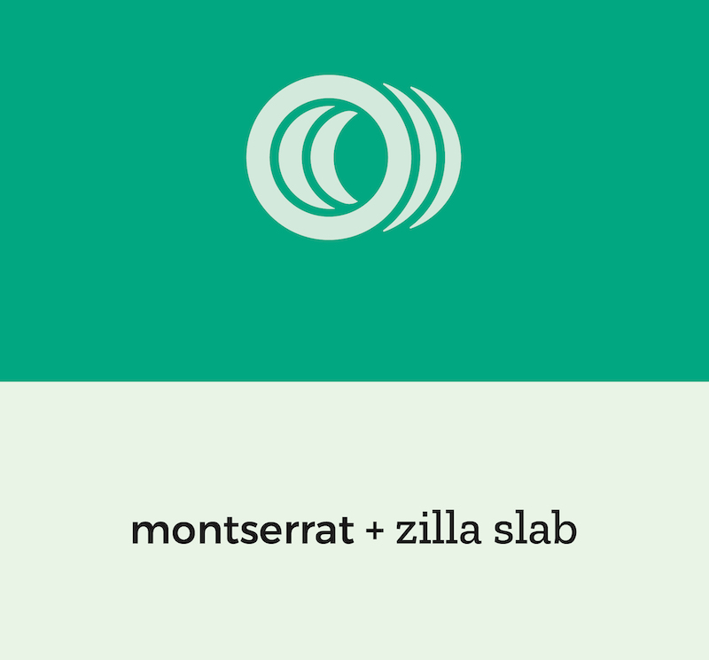
It is standard to select two fonts as your company wide font design; one serif font and one sans-serif font. Strategically selecting two different fonts that match your brand will give even the plainest of documents an element of design that is in line with your brand.
Combine your font selections with your color palette and you can turn virtually anyone on your team into a designer just by limiting their choices.
Create Great Company Graphics for Your Website, Social Media, Presentations, and Everywhere Else
You have your logo just about finished, you have a great color palette, and you have selected standard fonts for your company. That will cover a lot of uses, but not all. For instance, what images will appear when you share your website on social media? What about when you have an event coming up and you want to create a flyer or a promotional image, what will that look like?
Having these three items – logo, color palette, and standardized fonts – is a great start to your visual branding, and if that’s all you did it would put you light years ahead of your competition. However, you don’t want to stop short of having a great all-around visual branding strategy.
What you want are visual marketing assets that establish visual standards for all your design work. These visual assets will bring continuity to your brand and design elements across all mediums. If an employee gives a presentation in Detroit, when an attendee searches for your company online, they will find a website that matches the presentation slide deck. It is really that simple.
In the same way that your company brand is established through the interactions clients have with your staff, your company brand is also created through the visual representation of your company on all channels and all mediums. Every time a user or client sees your company name, what do they think? Can someone easily associate your email signature with your website? Does your stationary have a similar look to your social media accounts?
When there are no standards to your visual marketing, three things are likely to happen.
- Your company’s visual brand will consist of graphic templates found on free graphic design sites, as opposed to a collection of branded visual assets.
- You or someone from your team will spend hours every month creating new designs for every application you have, rather than relying on several templates meant to work for all applications.
- Your brand standards will be replaced by the individual visual preferences of whoever is designing graphics for your company.
Having a collection of visuals created to inspire and guide all your additional visual design will help you maintain a consistent visual brand across any and every medium where your brand could be communicated.
Creating A Brand Style Guide
As you approach the finish line of creating your visual design standards, it’s time to collect your logo, colors, visual marketing assets, and other visual collateral into one place. That one place is called a brand style guide.
Style guides are a lot of work to put together, but a lot of fun to look at. More importantly, they are really helpful for keeping everyone – employees, vendors, contractors, and designers – all in the proper design lane.
When you begin looking at creating an official style guide you will quickly find there are several levels of depth you can pursue. A simple style guide might contain the following:
- A depiction of each logo layout including icons and alternate layouts
- Brand color palette swatches with corresponding HEX codes, RGB numbers, CMYK numbers, and Pantone color equivalents
- Company font selections
This style guide may even contain a link to where the all logo files and logo file types can be downloaded publically.
A more in depth style guide would include the above and possibly the following:
- Examples of logo placement with spacing guides
- Explanation of the logo, what it means, and how it is to be used
- Depiction of proper logo usage as well as examples of what it looks like when a logo is squashed, stretched, scrunched, and otherwise used improperly
- Expanded color palette with specific colors for specific applications
While not a rule, the larger the organization, the more in depth the style guide. A small company can protect the brand fairly easily with everyone in the same location. A medium sized company may have two locations but operate as a centralized unit. A large company may have hundreds of employees spread out over multiple locations and the protectors of the brand are most likely not capable of previewing everything that needs to go out. Thus a style guide to advocate for the brand is useful.
Creating A Writing Style Guide
An extension of a brand style guide is a writing style guide. There are many different ways to approach your writing standards and different ways to think about it. From tone to technicalities to rule interpretations, there is a lot that can vary from writer to writer.
Your writing style guide should provide clear direction in all areas of written word for anyone communicating on behalf of the company to a public audience. It should also provide basic direction for the tone and attitude all employees should take in all their written communication
Creating A Writing Personality and Consistent Tone
As we’ve already discussed, your brand is being formed even when the logo cannot be seen. Customers are always forming beliefs about you and your services. The personality and tone you choose for all your writing will help shape their beliefs.
In person, communication is 80% what someone sees and 20% what someone hears. When you are not in front of your client you immediately lose the power and influence of non-verbal communication, leaving all communication to what someone reads, leaving a lot of room for misinterpretation.
Consider the following.
Let’s say a customer is having a hard time finding a document that you sent them via email. They’re tired of looking so they email you saying:
“Hey Dave, I’ve been looking all over for that document you sent. I haven’t been able to find it. Can you forward it to me again and copy my co-worker on the email?”
You now have several different ways you can respond.
Response Option 1
You could do exactly what they’ve asked and not include any text at all, just hit reply with the document attached. What message are you really sending?
Were you mad at them for asking again so you didn’t include any text? Probably not, but the client doesn’t know that. Nor does the co-worker that you attached whom you have not yet met.
What kind of personality do you see in this response?
Response Option 2
You can reply back, copy the co-worker, and deliver exactly what was asked for saying, “Here you go.”
What type of attitude or personality does that communicate?
Response Option 3
You can reply back with the document attached and say, “Hi Sandy, good to hear from you. Nice to meet you, John. Here’s the document that you requested.”
That’s a lot better than the first two. How about we go a little further with it. What do you think about this reply:
“Oh rats, I hate it when that happens – and it happens to me all the time. 🙂 Of course I can send that over, it would be my pleasure. Hope to talk soon, Sandy. John, nice to meet you. Hopefully we’ll get to meet face-to-face soon.”
Each response functionally supplies the same end result, but they all communicate in a different way. One reply is not necessarily right and one is not necessarily wrong. They are vivid examples of how our written communication may be received. At Shrein Media we lean towards the personality of empathy so the “Oh, rats…” reply would be most appropriate for us.
Ultimately, you want to make the choice of whether you want to lean more professional with less personality or lean more personal with an emphasis on authentic communication verses proper and ‘matter of fact’ etiquette. Whatever you choose, writing it down is hugely important for helping your team understand the expectation you have for their written communication.
Using Consistent Grammar In Your Writing
Your grammar and punctuation is also important to standardize. As straightforward as grammar may seem to be, there is actually a lot of room for interpretation. So much so that organizations will develop their own writing style guide as well as entire industries adopt their own standards, all in an effort to establish norms, enforce style, and improve communication.
As much as there are ‘universal standards’ for writing, your individual company may want to break from protocol in order to better communicate to your audience or better establish an idea in a slightly different way. This practice is perfectly acceptable in today’s marketing and communication climate; to maintain an air of professionalism you will want to make sure those breaks are consistent and done for the right purposes.
A few of the ‘grey’ areas where there may be room for interpretation in your writing include:
- Oxford comma usage
- Communicating proper nouns (for instance, Apple doesn’t say ‘the iPhone’ but rather ‘iPhone’)
- Using slang
- Whether or not to incorporate emojis as either a replacement for words or in addition to words.
At the end of the day, you determine how you want to portray your company through your writing; whatever you decide it should include professional grammar, correct spelling, and informed punctuation.
Creating A Great Business Narrative to Round Out Your Branding
Everything we’ve discussed works together to create your company’s narrative or story. You want to remove ambiguity in the mind of your customer about who you are and what you value, replacing it with a carefully crafted image and story. What you want a customer to think and believe about you needs to be injected into the your brand’s narrative.
This means that you will have to take time to decide how every experience with your business should look to the customer. You don’t have to tackle it all at once – pick one area and go from there.
Here are a few areas you’ll want to consider in your visual design, website language, company marketing materials, etc.
- How and why did your company begin?
- How does your company think and feel about its employees?
- Where did the company name come from?
- How does the company think of its customers?
- What does your company love most about its customers?
- What role does your company see itself playing in the world?
- What does success look like on a daily basis for your company?
- How do you want customers to feel when they contact your company for support, help, or to voice a concern? How would you want them to describe their experience?
- In what ways are employees empowered to make customers feel special?
As you put all the pieces together – logo, colors, fonts, visual marketing assets, writing style, client experience, and your company narrative – you are setting the bar for your customer’s experience expectations. And after they have a great brand experience, you have already provided them with the words and images to describe to someone else exactly who you are and what you do.
Don’t read past that. Let’s say it again.
All the work you have put into creating your brand gives clients words and images to describe who you are and what you do.
Maybe let’s say it another way.
Instead of your client describing you in his or her own words, they lean on the language and images they took away from their experience with you and now repeat YOUR WORDS to their colleagues, friends, family, and superiors.
That’s pretty powerful stuff.
Taking the First Step to Creating a Great Brand With A Great Logo
You are tasked with creating a great logo for your company and now you’re equipped with the knowledge that a great logo means nothing if it doesn’t have a great brand behind it. The only bad thing is that creating a great brand is a lot more work than just creating a logo and without a great brand, a great logo is impossible.
You don’t have a lot of extra time to start thinking about how to take on what suddenly became a much larger project scope. Don’t feel like you have to take everything on all at once. As mentioned above, pick one area and go after that. Start with developing a great company narrative. Work with three or four others from your company (and the owner if possible) to begin answering some of the questions in the previous section. This is a process that could take a long time, but doesn’t have to. If you spend 90 minutes of highly focused energy answering the questions, you’ll have great feedback to get started on your logo.
After you have created a rough company narrative, take some time to begin answering some of the following questions.
- Why do we want a new logo at this point in time?
- What inspired the conversation to design a new logo?
- What do we want our logo to communicate about our brand?
- How do we want people to feel after engaging with our company for the first time?
- How do we want clients to describe our company to friends and family?
Should you choose to partner with an agency – uh, hem, like Shrein Media – that agency will want your company narrative and the answers to the questions above. They will take the lead in walking you through the process to deliver a design that you’re proud of and communicates well. They can go as in depth as you’d like in creating your style guide, all the way to your writing style guide.
You are the expert in your industry and you deliver end results that your clients would otherwise be incapable of producing on their own. If you want to experience the same level of excellence when the time comes to brand your company, best to work with someone you trust who can set you up to succeed just like you set your clients up to succeed.
Everything mentioned above we have done at Shrein Media and continue to do for our clients on a daily basis. If you’d like someone to weigh in on you situation, even if you’re not ready to commit to anything, we are always happy to spend time listening and bringing clarity so you can take the correct next step. You’re not alone and you shouldn’t feel alone – we will come along side you and help you accomplish the bigger goals you have for your company by helping in the areas we’re best equipped to handle.
Here’s to you creating an amazing business brand with an amazing company logo! Best of luck!